

Pandemic of the Boosted...
Pandemic of the Boosted...
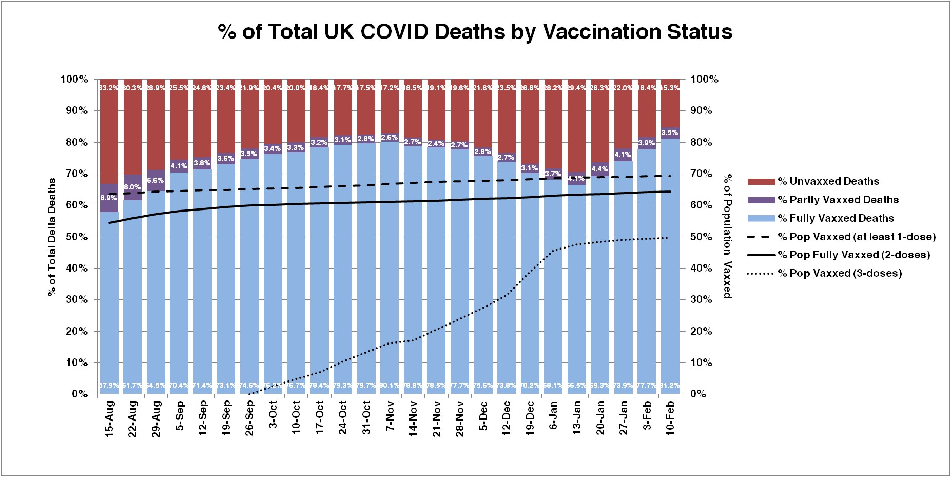
Death rates of "max vaxxed" UK...

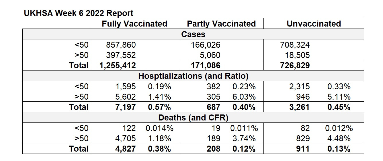
Well, having missed a week, here’s the latest update to the chart based on the latest UKHSA data, and it’s not pretty 😬:
Again, as I’ve mentioned before, the chart should be taken with a grain of “Simpson’s Paradox” salt, since the rates and numbers for over and under 50 years old are quite different. Here’s the latest breakdown of those:
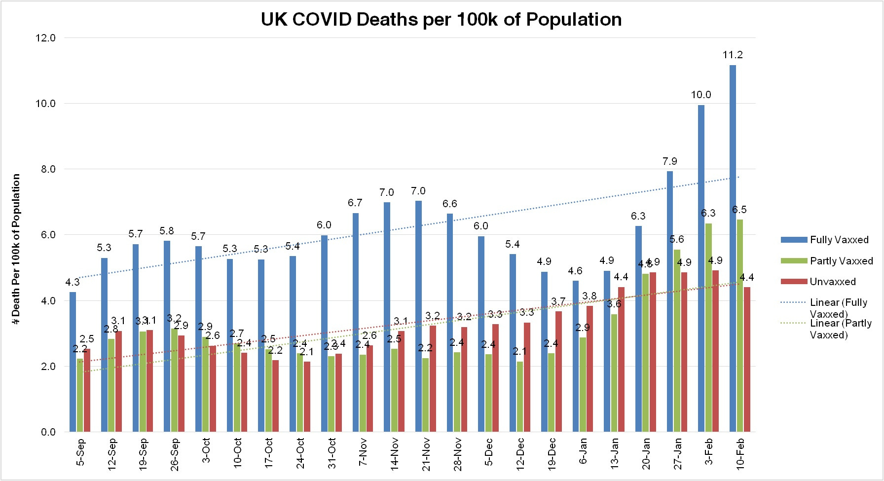
Nonetheless, despite Simpson’s paradox, the graph above shows some trends, and they are not good for the vaxxed and/or boosted. While boosting brought the vaxxed/unvaxxed death ratio down a bit, it’s already risen to its highest level yet with no end in sight.
From the numbers in the table above, it looks like if you’re under 50 and vaxxed you’re less likely to get hospitalized (0.19% vs. 0.33%), but more likely to die (.014% vs. .012%).
One other interesting data point - it looks like the UK has reached “max vaxxed” status since the only vaccination numbers growing in this report are those getting the second dose (64.2% increasing to 64.4%) and the third “booster” dose (49.4% increasing to 49.7%). In sharp contrast, the percentage of the population with at least one dose did not budge this week (for the first time since they’ve been reporting) staying steady at 69.2%. It looks like 30.8% or so of the population is going to stay strong and take a pass on this tragic medical experiment.
If you want to read a good theory as to why these numbers look like this, I recommend this post.
That author’s hypothesis seems to be borne out in data like this (based on max % and UK population of 67.1 million):
I think we need to stop shooting people up with these shots right now and figure what the **** is going on!